Beelinguapp Redesign - Community Stories

Role UX Researcher + Designer
Year 2025
Type Educational Technology
Timeline Feb – May 2025
Team Ashley, Michael, Harry, Timothy, Luke
Key Skills Affinity Diagramming, Thematic Analysis, Figma Prototyping, Heuristic Evaluation, UI Design

Highlights

Limited cultural content and missing community engagement were critical issues.
Conducted user interviews and iterative testing cycles for community story features.
Designed intuitive community interaction and content creation tools to address racial inequalities in language education.

Background & Pain Points

Language Education & Cultural Engagement

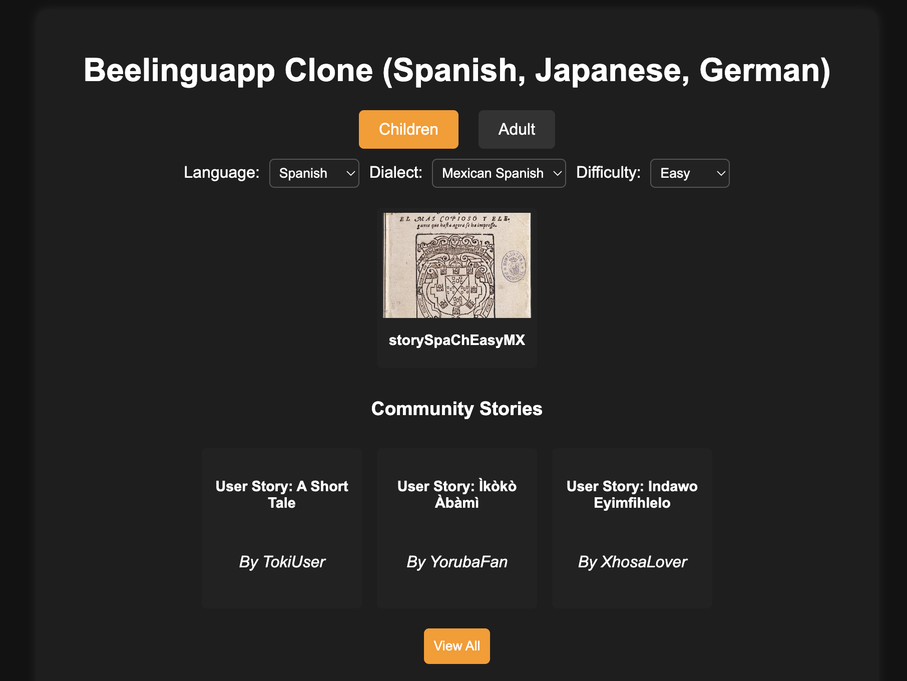
Beelinguapp provides stories in target languages translated into users' home languages, tagged by difficulty levels, but has significant shortcomings in personalization and cultural depth. Users, particularly English learners (EL students), faced challenges with:

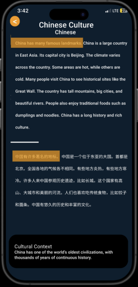
  • Lack of culturally relevant storylines.
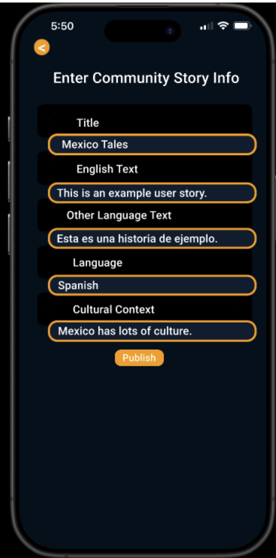
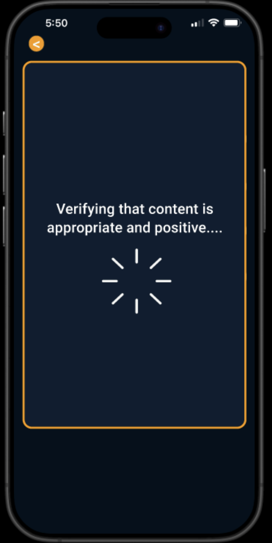
  • Absence of community-driven content and user-generated cultural narratives.
  • Limited context for available stories, making content engagement superficial.

These limitations contributed to disengagement and stereotype threat, negatively affecting language acquisition and student motivation.

Existing Beelinguapp Interface showing limited cultural content

Competitive Analysis

We reviewed leading language-learning apps (Duolingo, Memrise, LingQ) and found none offer true community-driven storytelling or deep cultural context. This gap directly informed our feature set and prioritization.

Personas

Photo of Jorge Hernandez

Jorge Hernandez

  • Age: 51
  • Occupation: Middle School Teacher
  • Location: Houston, Texas
  • Education: Master’s in Education
  • Tech Proficiency: Medium / High

Goals

Implement research-backed ed-tech to address language inequalities in his ESOL classroom.

Frustrations

Students falling behind due to inconsistent ESOL programs and lack of faculty training on new tools.

Original Low-Fidelity Wireframe

Original low-fidelity wireframe

My initial sketch focused on the core “Community Stories” flow, with:

  • Placeholder cards for each story entry
  • Basic navigation tabs (“All Stories” / “My Stories”)
  • Simple “Add Story” button in the top-right
  • Minimal legend for metadata (date, author, language)

This low-fi version helped validate the information hierarchy before moving into mid-fi mockups.

UX Research

Responsibilities + Data Collection & Analysis

Affinity Diagram showing user insights clustered

As UX lead for Community Stories, my responsibilities included:

  • Designing an initial concept based on language inequality research.
  • Conducting iterative user testing to refine usability and inclusivity.
  • Analyzing feedback through affinity diagrams to pinpoint key user insights.

Primary methods of data collection:

  • Contextual inquiries with diverse bilingual users.
  • Think-aloud usability tests for the mid-fidelity prototype.
  • Competitive review of similar apps (Duolingo, Memrise, LingQ)
  • Interviews with 3 language-instructor stakeholders
  • Heuristic evaluation of existing community-sharing workflows

Analysis methods included:

  • Qualitative thematic analysis of user feedback.
  • Affinity diagramming to cluster insights into actionable improvements.

Exploring the Problem Space & Affinity Diagramming

To ground our design in real user needs, I led an affinity‐diagramming workshop to synthesize qualitative insights from our contextual inquiries and think‐aloud sessions. This helped us:

  • Cluster user quotes & observations into thematic groups.
  • Surface recurring pain points around cultural relevance and engagement.
  • Identify key opportunity areas for community storytelling features.

The resulting affinity map became our north star—driving feature prioritization and informing the initial prototype.

Affinity Diagram mapping user insights into clusters

Design Solutions & Iterative Prototyping

Initial Prototype (V0)

  • Community story page with basic "Add Story" feature and search functionality.
  • Preliminary filtering for community-generated content.

User feedback indicated a positive reception of the dedicated community page and search functionality but pointed to issues with insufficient filtering and unclear story contexts.

Initial Prototype of the Community Story Page
Mid-Fidelity Prototype with enhanced search and preview feature

Mid-Fidelity Prototype (V1)

Enhancements:

  • Improved search functionality with live search capability.
  • Added Community Preview on the homepage for initial user engagement.

Feedback identified a need for additional filtering, clearer story contexts, and better UI presentation for the preview component.

High-Fidelity Prototype (Final Design)

Final iteration included:

  • Advanced filtering options (date of submission, popularity).
  • Improved UI with carousel display for homepage preview component.
  • Contextual enhancements such as tags, brief descriptions, and story synopsis.
  • Verification and confirmation states for story uploads.
Final High-Fidelity Prototype showcasing advanced filtering and improved UI
Story reading interface with bilingual content

Justification & Learning Science Integration

Community-driven storytelling aligns with key educational principles:

  • Linguistic Inclusivity: Supports multilingualism by allowing content in diverse dialects and languages, addressing content gaps and promoting deeper user engagement.
  • Counter-Narratives & Identity: Empowers marginalized learners to share affirming, culturally relevant stories, combating stereotype threat.
  • Sociocultural Learning: Encourages active peer engagement and social learning through discussions and community contributions.

This design reflects the Recognition Over Recall and Consistency & Standards UI principles, providing an intuitive, inclusive, and engaging experience for diverse language learners.

Beelinguapp Logo

User Testing

We ran five discrete usability sessions with both team members and external bilingual users:

Reflection & Next Steps

Iterative testing was indispensable—each cycle revealed both usability wins and new pain points. In particular, our filtering feature received strong praise, and standardizing the Figma frames greatly improved layout consistency. Going forward, I plan to:

If I could tweak the assignment, I’d front-load the Figma workshops and extend the user-testing window to better accommodate busy schedules.